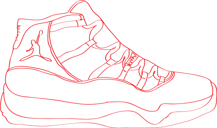
Thursday 5 December 2013

Typography Portrait

Michael Jordan Typography Portrait
Creation: I created my typographic portrait with the Adobe Illustrator CS4. I simply started my portrait by placing a picture of Michael Jordan in the background to have a guide to building his face. From the photo I have chosen, I started creating the neck first to simply have a base to work on. I used letters and numbers that would fit best in my eyes and distorted them to fit in the right areas. Then I started placing the important texts (AIR, 23, JORDAN, JUMPMAN, and NIKE) to have "islands" to work around with. After placing the important texts, I started filling in the empty spots with the best letters and numbers I could find to form and shape the rest of Michael Jordan's face.

Monday 4 November 2013

The Audition Poster

Young Company - The Audition Poster
          For my poster I decided to use the photos taken for "The Audition" play and placed it in the middle as if its the center of attention, which an audition is. I decided to make the size of the title the biggest in the poster to emphasize what is being presented and coloured it purple to give it contrast from the background to make it stand out.I decided to colour some of the text turquoise to emphasize the important information, such as: the group presenting, the date and time, cost of tickets, where the proceeds are being taken, and etc. I decided to text wrap the information in the middle of the poster to show a simple illusion, as if the text are moving around or behind the chair, and also making it more visually pleasing or less boring. In my opinion, I am satisfied with my work and would only change minor factors if I was given more time. It was my first time using Adobe Photoshop which is why I had some technical issues, but just tried my best to use the program.

Tuesday 15 October 2013

Young Company Logo Assignment

Lakeshore C.I Young Company Logo B&W

Lakeshore C.I Young Company Logo Colour


          For my logo I decided to put an opera mask to show that it is a drama group being presented, a phoenix in the background to show the main mascot of the school, and used  Lakeshore C.I's school colours to represent and involve more of our school. I decided to colour the phoenix and letters blue to make it more stand out, to give it more emphasis. I decide to give the mask and background circle value for the mask to look more realistic and the background circle to make it seem like it is shining, as if it was new and young. In my opinion I am really satisfied with the logo I created and would not change anything from my perspective unless a teacher or a professional artist told me to. I had some technical issues of colouring the logo, but ended up finding an unprofessional solution, which was filing the spaces with another layer of colours. 

Monday 23 September 2013

Jordan 11 Concord Tracing

NJ Jordan 11 Sketch

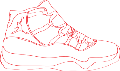
NJ Jordan 11 Tracing No Colour
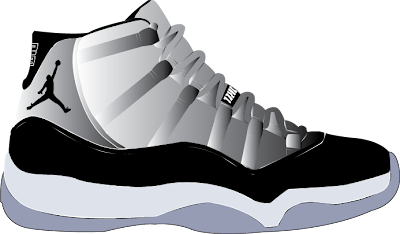
Element & Principles of Design:
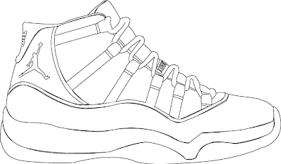
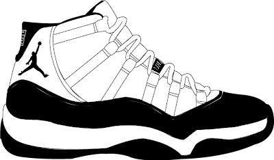
          As you can see in all the pictures, you can see Line with the structure and features of the shoes. You can see Contrast in the second picture with the black and white colour of the shoes. You can see Pattern in all the shoes with the lace holders. You can see Space in all the shoes from the sole and mid-soles of the shoes. You can also see Value in the third picture with the colour shading. You can see Colour in the third picture. You can also see Unity and Form in all the shoes with the soles and mid-soles, they seem like they belong in that feature of the shoe.
NJ Jordan 11 Tracing B&W
Technical:
          For tracing and recreating this shoe, I generally mostly used the Pen Tool to create the features and design of the shoe. I used the Layers window to separate and capture the different features and design of the shoe. In terms of the colours of the shoes, I used the Eyedropper Tool and the Gradient colour for different areas of the shoe. I also used the Selection Tool to drag and put some of the features of the shoes in the right places.


NJ Jordan 11 Tracing Colour
Opinion:
          The third picture is what I personally thought that was visually pleasing because of the colours and how realistic the shoe ended up looking, a little bit identical with the original picture I used to recreate the shoes.

Tuesday 17 September 2013

Leaf Guy Tracing

First time tracing on computer and using Adobe Illustrator CS4
NJ Leaf Guy Tracing JPEG Format
NJ Leaf Guy Tracing PNG Format